
在网站根目录下创建index.html和index.css文件,然后分别填入以下的代码即可。(不要复制错后缀文件哦)
index.html代码文件如下:
<!doctype html>
<html lang="en">
<head>
<meta charset="UTF-8">
<meta name="Author" content="圣诞树">
<title>52分享网·圣诞树</title>
<link rel="stylesheet" href="index.css"/>
<meta name="viewport" content="width=device-width, initial-scale=1, maximum-scale=1">
</head>
<body>
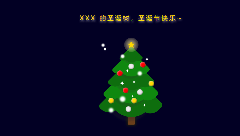
<p class="word">XXX 的圣诞树,圣诞节快乐~</p>
<div class="tree">
<div class="star">
<div class="star-in"></div>
</div>
<!--树叶-->
<div class="leaf-box">
<div class="leaf">
<div class="edge"></div>
<div class="edge right"></div>
</div>
<div class="leaf">
<div class="edge"></div>
<div class="edge right"></div>
</div>
<div class="leaf">
<div class="edge"></div>
<div class="edge right"></div>
</div>
<div class="leaf">
<div class="edge"></div>
<div class="edge right"></div>
</div>
<div class="leaf">
<div class="edge"></div>
<div class="edge right"></div>
</div>
</div>
<!--树干-->
<div class="trunk"></div>
<!--彩色的球-->
<div class="ball-box">
<div class="ball b1"></div>
<div class="ball b2"></div>
<div class="ball b3"></div>
<div class="ball b4"></div>
<div class="ball b5"></div>
<div class="ball b6"></div>
<div class="ball b7"></div>
<div class="ball b8"></div>
<div class="ball b9"></div>
</div>
<!--闪烁--->
<div class="sparkle">
<span>✦</span>
<span>✦</span>
<span>✦</span>
<span>✦</span>
<span>✦</span>
<span>✦</span>
</div>
<div class="blink">
<div></div>
<div></div>
<div></div>
<div></div>
<div></div>
<div></div>
</div>
</div>
</body>
</html>
index.css文件代码如下:
html,body {
    width: 100%;
    height: 100%;
}

* {
    margin: 0;
    padding: 0;
}

body {
    background-color: #020024;
}

.word {
    font-size: 22px;
    text-align: center;
    color: gold;
    padding-top: 50px;
    letter-spacing: 5px;
    text-shadow: 2px 4px 9px rgba(255,255,255,0.7);
}

/*圣诞树外层div*/
.tree {
    width: 200px;
    height: 300px;
    margin: 80px auto 0 auto;
    position: relative;
    /*相对定位*/
/*     border: 1px solid #fff; */
}

.star {
    width: 50px;
    height: 50px;
    position:absolute;
    background-color:#fff;
    border-radius:50%;
    top:-25px;
    z-index:1000;
    left:50%;
    transform:translateX(-50%);
    animation:starLight 1.5s ease infinite alternate;
}
.star-in{
    position:absolute;
    left:50%;
    top:50%;
    border-right:100px solid transparent;
    border-bottom:70px solid gold;
    border-left:100px solid transparent;
    transform:translateX(-50%) translateY(-50%) rotate(35deg)
    scale(0.14);
}
.star-in:before{
    border-bottom: 80px solid gold;
    border-left: 30px solid transparent;
    border-right: 30px solid transparent;
    position:absolute;
    top:-45px;
    left:-65px;
    content:'';
    transform:rotate(-35deg);
}
.star-in:after{
    border-bottom: 70px solid gold;
    border-left: 100px  solid transparent;
    border-right: 100px  solid transparent;
    position:absolute;
    top:3px;
    left:-105px;
    content:'';
    transform:rotate(-70deg);
}
@keyframes starLight{
     0% {
        background: radial-gradient(ellipse at center,
        gold 0%, rgba(255, 240, 158, 0.5) 42%,
         rgba(255, 242, 173, 0.2) 58%,
          rgba(255, 255, 255, 0.1) 100%);
    }
     25% {
        background: radial-gradient(ellipse at center, gold 0%,
         rgba(255, 240, 158, 0.5) 40%,
          rgba(255, 242, 173, 0.2) 60%,
          rgba(255, 255, 255, 0.1) 100%);
    }
      50% {
        background: radial-gradient(ellipse at center,
         gold 0%, rgba(255, 240, 158, 0.5) 38%,
         rgba(255, 242, 173, 0.2) 62%,
          rgba(255, 255, 255, 0.1) 100%);
    }
     75% {
        background: radial-gradient(ellipse at center,
         gold 0%, rgba(255, 240, 158, 0.5) 36%,
          rgba(255, 242, 173, 0.2) 64%,
          rgba(255, 255, 255, 0.1) 100%);
    }
    100% {
        background: radial-gradient(ellipse at center,
         gold 0%, rgba(255, 240, 158, 0.5) 34%,
          rgba(255, 242, 173, 0.2) 66%,
           rgba(255, 255, 255, 0.1) 100%);
    }
}
.leaf{
    position:absolute;
    left:50%;
    top:3%;
    margin-left:-30px;
    background-color:rgba(14,110,14);
    width:60px;
    height:60px;
    border-radius:0 10px 35px 10px ;
    transform:rotate(45deg);
    box-shadow:2px 7px 2px rgba(43,43,43,0.2);
}
.edge{
    position:absolute;
    left:0;
    bottom:0;
    background:rgba(14,110,14);
    width:25px;
    height:30px;
    border-radius:0 10px 35px 10px;
    transform:translateY(50%) translateX(0);
}
.edge.right{
    position:absolute;
    left: unset;
    bottom: unset;
    top: 0;
    right: 0;
    background:rgba(14,110,14);
    width:25px;
    height:30px;
    border-radius:0 10px 35px 10px;
    transform:translateY(0) translateX(50%);
}
/*双数修改背景色*/
.leaf:nth-child(even){
    background-color: #0f880f;
}
.leaf:nth-child(even) .edge{
    background-color: #0f880f;
}
/*最上面*/
.leaf:nth-child(1){
    z-index:100;
    transform: rotate(45deg) scale(0.8) ;
}
/*第二*/
.leaf:nth-child(2) {
    z-index: 99;
    top: 15%;
    transform: rotate(45deg) scale(1.3) ;
}
.leaf:nth-child(3) {
    z-index: 98;
    top: 28%;
    transform: rotate(45deg) scale(1.6) ;
}
.leaf:nth-child(4) {
    z-index: 97;
    top: 41%;
    transform: rotate(45deg) scale(1.9) ;
}
.leaf:nth-child(5) {
    z-index: 96;
    top: 54%;
    transform: rotate(45deg) scale(2.2) ;
}
.trunk{
    width:25px;
    height:45px;
    border-radius:0 0 3px 3px;
    position:absolute;
    left:50%;
    transform:translateX(-50%);
    bottom:20px;
    z-index:1;
    box-shadow:0 0 10px 5px rgb(19,19,19);
    background:linear-gradient(0deg,#6d411b 0%,#5a341d 64%);
}
.ball{
    width:20px;
    height:20px;
    background:#f00;
    box-shadow:-1px -1px 6px inset #600,1px 1px 8px inset #ffc9c9;
    border-radius:50%;
    z-index:101;
    position:absolute;
}
.b1{
    left: 25%;
    top: 30%;
}
.b2 {
    left: 35%;
    top: 50%;
}
.b3 {
    left: 65%;
    top: 20%;
}
.b4 {
    left: 45%;
    top: 22%;
}
.b5 {
    left: 40%;
    top: 72%;
}
.b6 {
    left: 60%;
    top: 52%;
}
.b7 {
    left: 50%;
    top: 62%;
}
.b8 {
    left: 80%;
    top: 42%;
}
.b9 {
    left: 10%;
    top: 62%;
}
.b4,.b5,.b6{
    background:#ececec;
    box-shadow:-1px -1px 6px inset #615f5f,1px 1px 8px inset #fff;
}
.b7,.b8,.b9{
    background:gold;
    box-shadow: -1px -1px 6px inset #3a3101, 1px 1px 8px inset #fff;
}
.sparkle span{
    display:block;
    position:absolute;
    font-size:20px;
    z-index:101;
    color:#fff;
    animation:lights 1.5s ease infinite alternate;
}
/*闪烁动画*/
@keyframes lights{
    0%,100%{
        transform:scale(1);
    }
    50%{
        transform:scale(1.5);
    }
}
.sparkle span:nth-child(1) {
    left: 30%;
    top: 40%;
}
.sparkle span:nth-child(2) {
    left: 40%;
    top: 27%;
    font-size: 15px;
}
.sparkle span:nth-child(3) {
    left: 50%;
    top: 57%;
    font-size: 12px;
}
.sparkle span:nth-child(4) {
    left: 70%;
    top: 67%;
    font-size: 14px;
}
.sparkle span:nth-child(5) {
    left: 74%;
    top: 13%;
    font-size: 16px;
}
.blink div{
   width:3px;
   height:3px;
   background:#fff;
   z-index:101;
   position:absolute;
   border-radius:50%;
   animation:blink 1.5s ease infinite alternate;
}
.blink div:nth-child(2) {
    left: 34%;
    top: 13%;
    transform: scale(1.2);
}
.blink div:nth-child(3) {
     left: 54%;
    top: 43%;
    transform: scale(0.6);
}
.blink div:nth-child(4) {
    left: 64%;
    top: 33%;
    transform: scale(1.4);
}
.blink div:nth-child(5) {
     left: 34%;
    top: 63%;
    transform: scale(1.8);
}
.blink div:nth-child(6) {
    left: 14%;
    top: 76%;
    transform: scale(1.5);
}
@keyframes blink {
    0%{
        box-shadow:0 0 0 0 #fff;
    }
       25% {
        box-shadow: 0 0 1px 1px #fff;
    }
      50% {
        box-shadow: 0 0 2px 2px #fff;
    }
     75% {
        box-shadow: 0 0 3px 3px #fff;
    }
    100% {
        box-shadow: 0 0 4px 4px #fff;
    }
}
填写好以后直接访问您的网站域名/index.html,就可以看到一棵漂亮的圣诞树了。
源码效果
评论(0)
暂无评论